A Look at U.S. Airline Logos Since the 1920s
3 June 2013A logo is a graphic or image that’s associated with a particular company, organization, or individual and used to encourage instant recognition. The power of a well-designed logo can be immense, but what’s popular – what ‘speaks’ to people – changes over time and company logos evolve to change too. When two companies merge, their individual logos may be kept or left behind depending on the needs of the new company going forward.
Let’s take a look at the logos of the top four airlines over time.
American Airlines Logo History
American Airlines is no newbie to consolidations. The company was formed when a number of small airline companies were incorporated into American Airways, Inc. In 1934, American Airways became American Airlines, Inc. Up untiil the most recent logo redesign, their logo always held the eagle (although facing different directions) and used the colors of the American flag: red, white, and blue.
The first American Airlines logo (1934 – 1945):
American Airlines flipped the eagle to face the other direction and dropped the red color from 1945 – 1962:
Then, in 1962, the company cleaned up the brand to look like this:
In February, 2013, American Airlines and US Airways Group announced that the two companies would merge and retain the iconic American Airlines brand with the following logo:
(Image credits https://logos.wikia.com/)
Delta Airlines Logo History
Delta Airlines began its company history as the first aerial crop dusting company, formerly Huff Daland Dusters, and was established in 1924. It began international mail and passenger routes in 1927. It was an early supporter of the hub-and-spoke system where airplanes brought schedule passengers into a hub airport where they were then connected to other Delta flights to continue on to their destination.
The Delta Airlines logo changed often and so we include only a few variations here.
Delta Airlines logo 1929-1930:

Delta Airlines logo 1934-1951:

Delta Airlines logo 1953 – 1955:

Then, Delta decided to clean up the logo and make it simpler (Delta Airlines logo 1959 – 1960):

Later, the red and blue arrows were pointed upward instead of forward (Delta Airlines logo 2004 – 2007):

The current Delta Airlines logo:

(Image credits https://www.deltamuseum.org/)
Continental Airlines Logo History
Continental Airlines was founded in 1934 as Varney Speed Lines, which was named after Walter Varney who also started United Airlines (more on that later). Originally, Varney Speed Lines operated as an airmail and passenger service in the American southwest – Texas, New Mexico and Colorado.
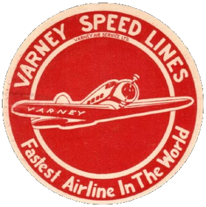
The airline was soon closely allied with Lockheed and flew Lockheed planes: the Model 9 Orion, the Electra Junior, and the Lodestar. Following the cancellation of all domestic air mail contracts by the Roosevelt administration in 1934, Robert Six purchased the airline and renamed it Continental Air Lines (later changed to ‘airlines’ in 1937).
In 1967, Continental introduced a new classic logo and returned to its original red hue:

In 1991, the company changed to a blue-hued logo and added the globe:

It was displayed in a few variations, including the longitude lines painted on the airplane tail fins in gold. There are even several versions where the word ‘Airlines’ is eliminated.
(Image credits https://logos.wikia.com/)
United Airlines Logo History
United Airlines was founded in Boise, Idaho in 1926 as Varney Air Lines – an air mail service of Walter Varney who also founded Varney Speed Lines which later became Continental Airlines. Varney Air Lines was renamed Boeing Air Transport in 1927 after it was acquired by the aircraft manufacturer.
In 1933 United began operating the Boeing 247 – the first all-metal airplane and able to fly transcontinental in 20 hours, which made it significantly faster than its earlier predecessors.
United Airlines first logo included an outline of the U.S. map. Notice the use of ‘air lines’ versus ‘airlines’ too:
After passage of the Air Mail Act in 1934, United became an independent company again and their logo looked like these two until 1939:
Through the 1930s and 1940s, the United Airlines logo took on the look of a badge or shield. They also added the U.S. map to demonstrate coast to coast service and later deleted it again:
On the mid-1950s through the 1960s, the shield theme held, but it was slanted:
In the 1970s, the United Airlines’ logo took on it’s tulip shaped ‘U’ effect which it continued through 2010. It was also here that ‘airlines’ became a single word:


In 2010, United acquired Continental Airlines in a merger and a strange twist of fate considering both were started from the same guy, Walter Varney. The two logos were merged as well:

(Image credits https://logos.wikia.com/)

DamianTysdal
Damian Tysdal is the founder of CoverTrip, and is a licensed agent for travel insurance (MA 1883287). He believes travel insurance should be easier to understand, and started the first travel insurance blog in 2006.
Damian Tysdal is the founder of CoverTrip, and is a licensed agent for travel insurance (MA 1883287). He believes travel insurance should be easier to understand, and started the first travel insurance blog in 2006.